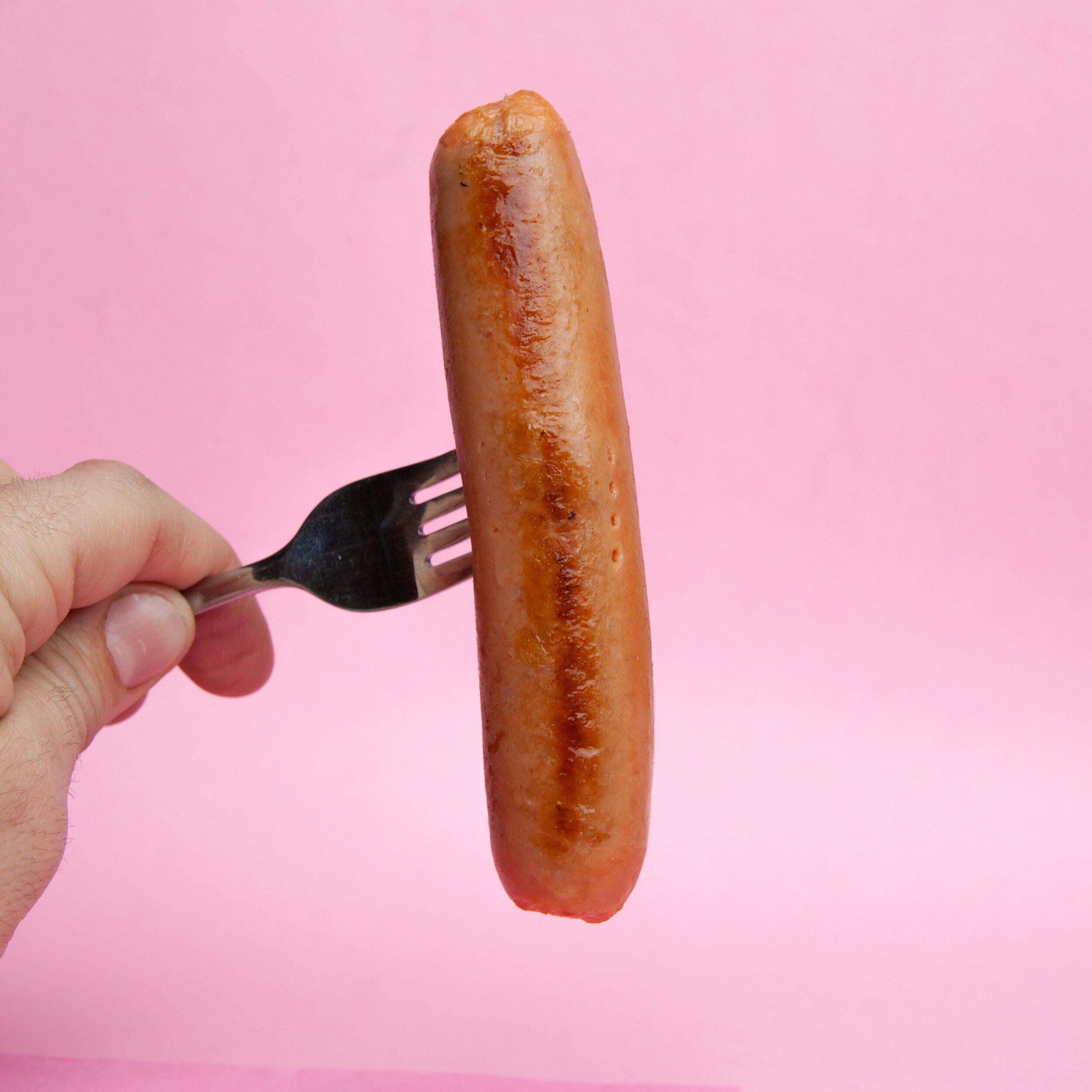
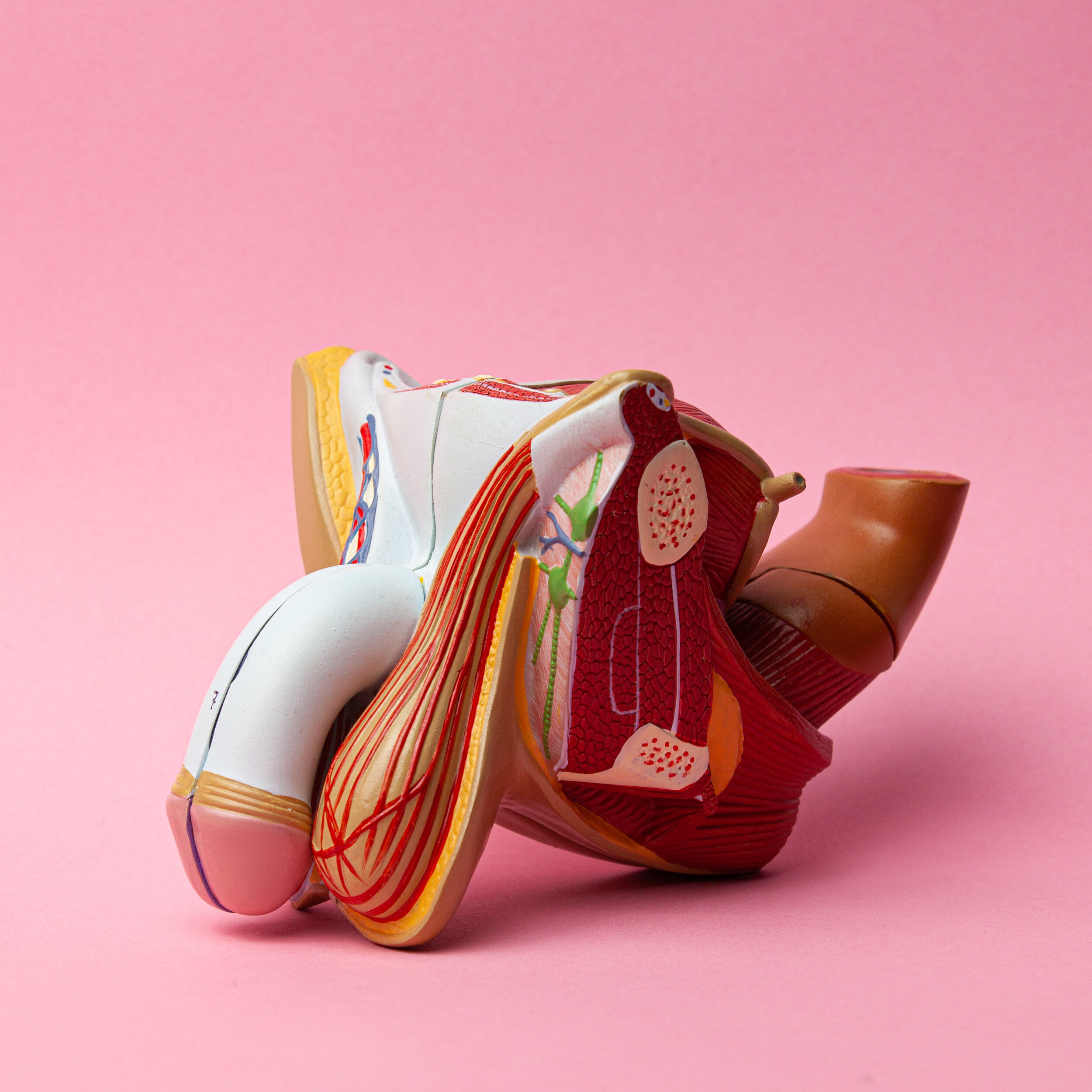
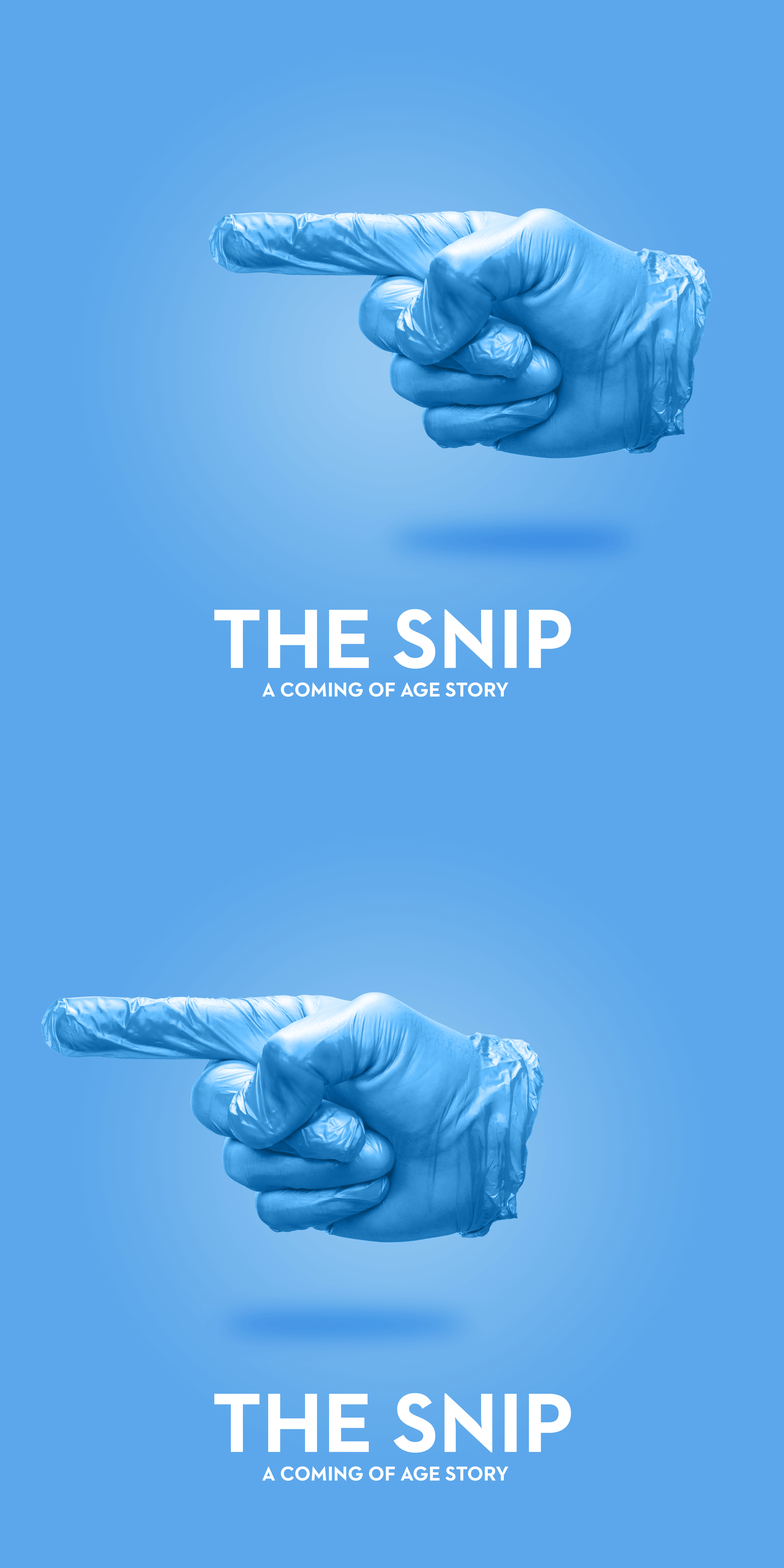
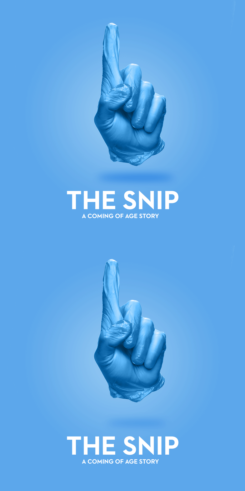
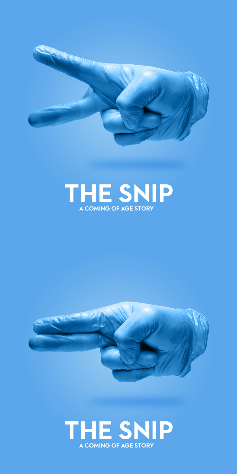
Producing the key art for my new short The Snip was a really fulfilling creative challenge. And the results are really eye catching, yet fairly straightforward so I thought I should post how I was able to put these together and play around with the results.
Attention grabbing key art is also lacking from so many shorts these days, that I really hope people start to recognise just how helpful this can be in catching your audience’s attention.
Step 1
Cycle through several different ideas in the concept stage.
Step 2
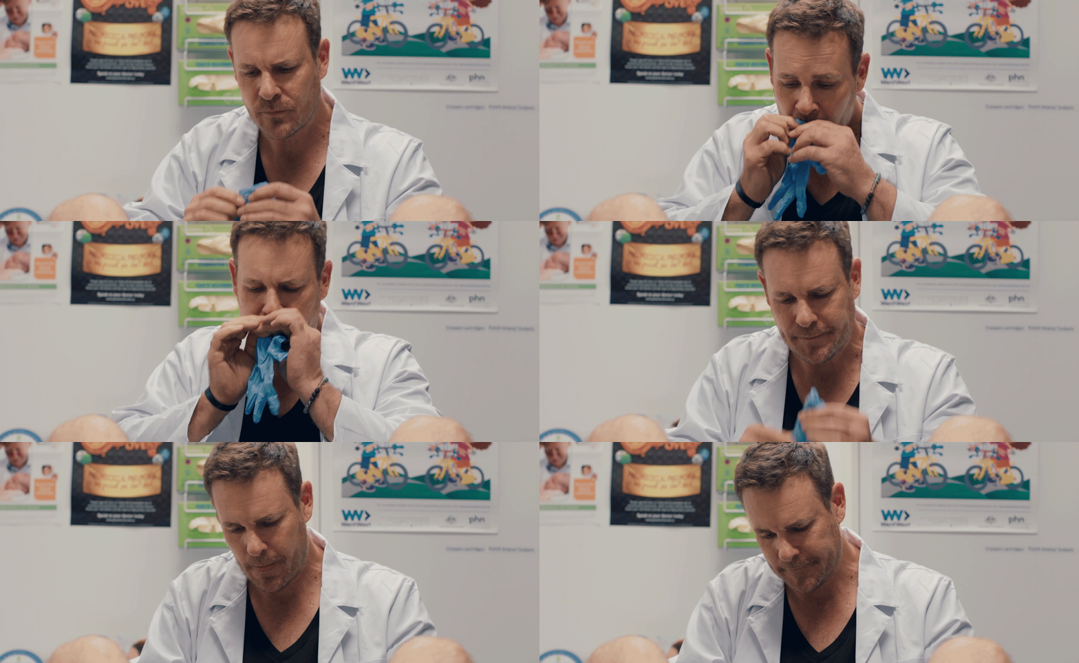
Realise that Aaron Jeffrey’s behaviour in the film with his gloves is iconic.
Step 3
Try to find the appropriate blue gloves which fit your hands. Tear through several until a local burger joint has the right size.
It probably helps if you can get it in focus.
Step 4
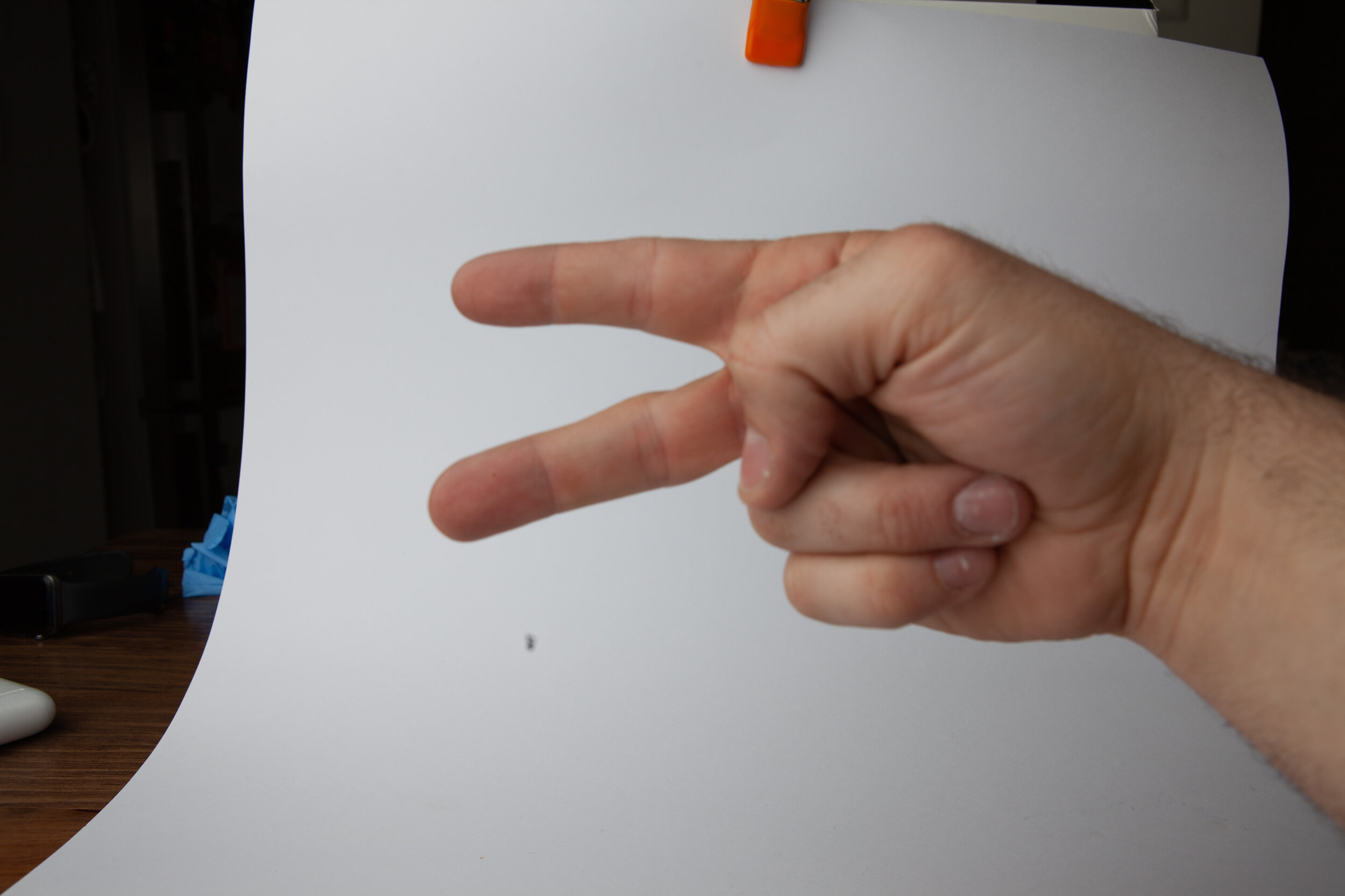
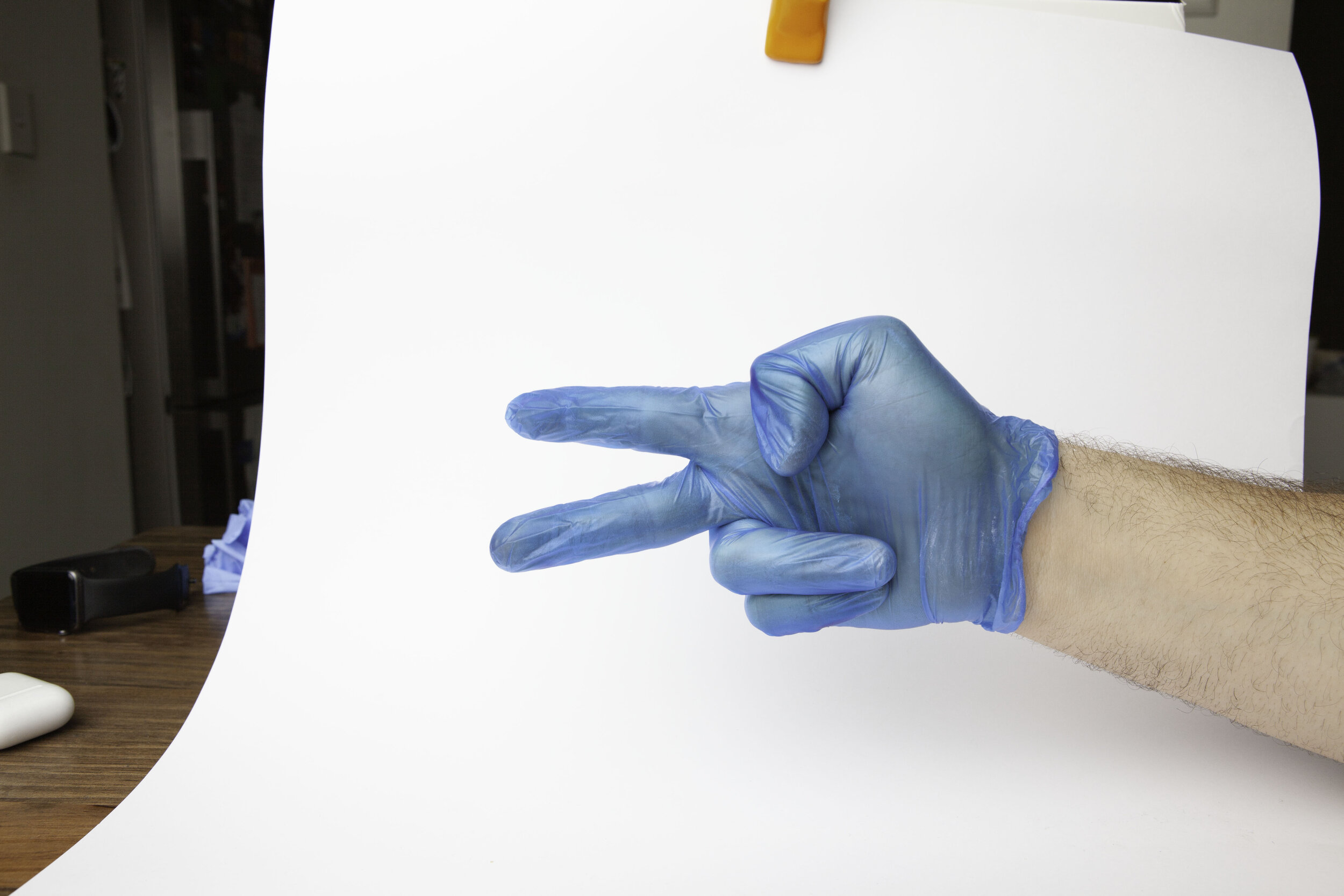
Create an impromptu photo studio in your living room, and experiment with lighting before eventually deciding that a large overhead soft source gives you the best overall quality of light. Use a white card behind to assist with the later selection and bounce more light into fill the shadows.
Plenty of thumb action happening here.
Step 5
Take a bunch of photos and experience that it’s kinda difficult to align your hand and activate the shutter at the same time, but eventually come to a realisation that you have a far more flexible forearm than you knew!
Step 6
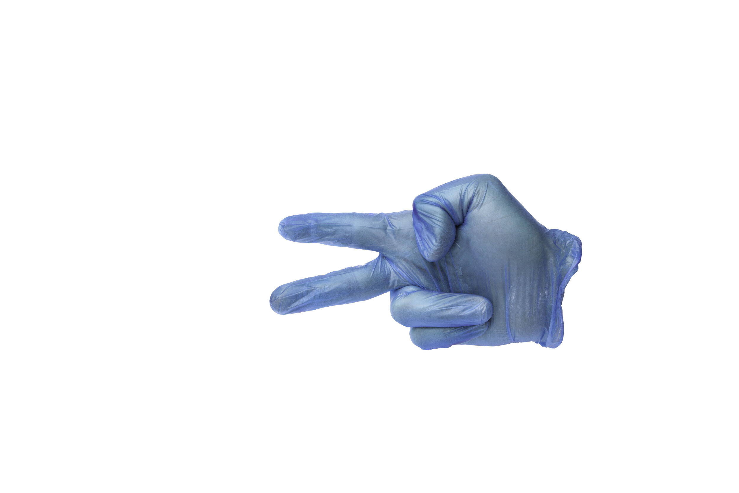
Cut out the hand from the background.
Step 7
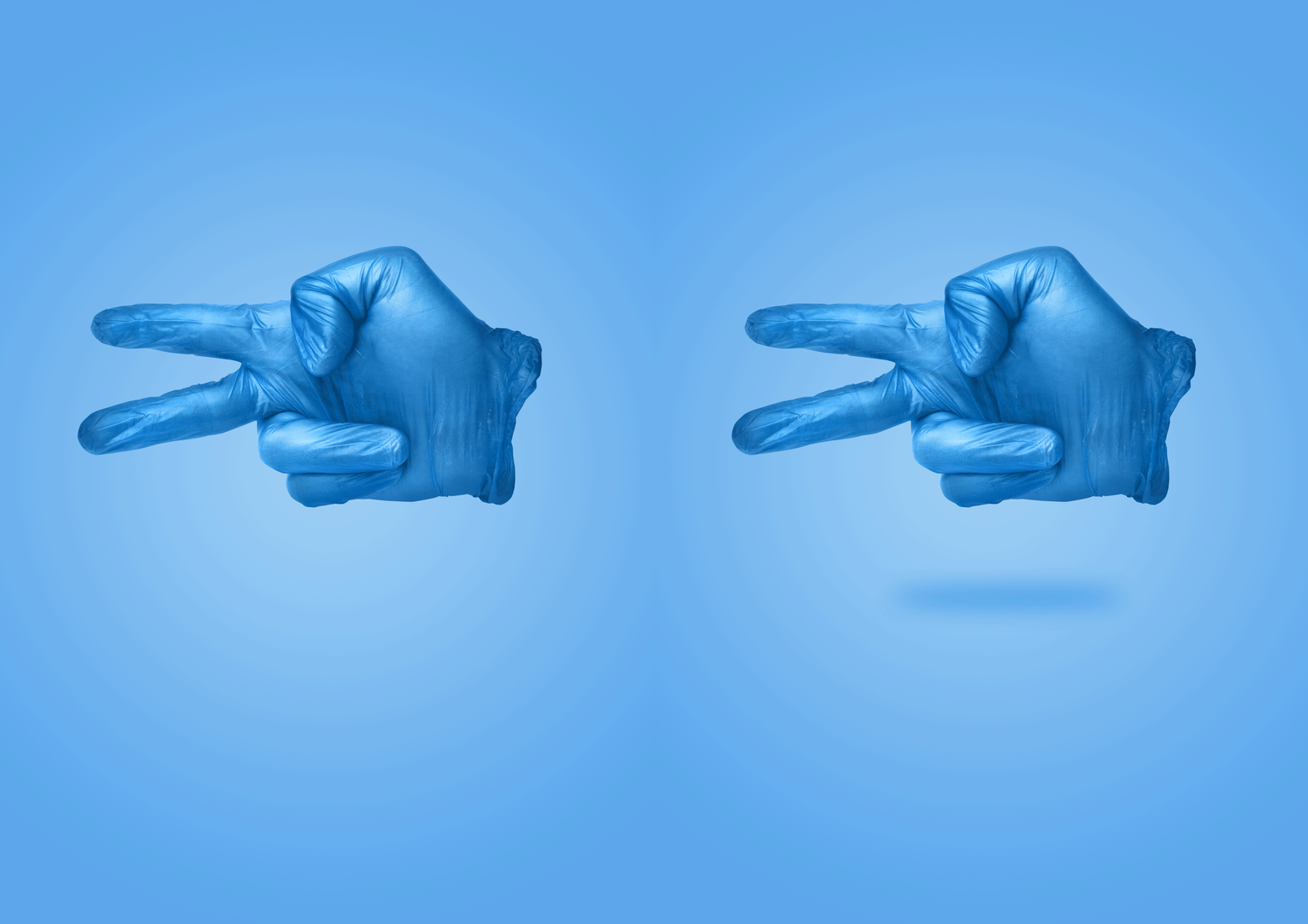
Make a radial gradient, then add the hand on top. Increase the contrast, then add a shadow underneath to give a sense of depth.
Add the text and then you’re done.
Finally, get carried away with the whole concept, start making motion gifs and knock out a bunch more variations on the theme.
It’s really great once you get a system in place, that you can really start knocking out a whole batch.
I was really surprised just how much the small shadow underneath the hand really made it pop and added a sense of dimensionality to the whole artwork.
Special thanks to Matt Alpass, who helped out with the original concepts for the designs, and to Seb Mrugalski who also helped out on the second shoot.


